It is recommended to read the “Modeling the outbreak of wars to understand the war cycle” beforehand. The concepts described there are used in this page.
The civil war in Iraq has allowed to start this “Materialization” issue, still in progress
Let’s come back to the 2nd Gulf War against Iraq in 2003. The opponents of the “War Cycle” will find there a remarkable case against the “War Cycle”. The outbreak of this war took place at the peak of attenuation, just like someone (imaginary) who would have wanted to demonstrate that this Cycle makes no sense or would have wanted to minimize as much as possible the regional repercussions by avoiding the involvement of other regional actors.
What happens in such a remarkable case?
- In principle, this shows that the “War Cycle” is meaningless, since the outbreak of war takes place at the moment of a peak of attenuation.
- But if we take into account the Combination 3 described in “Modeling the outbreak of wars to understand the war cycle” we should have a form of overviolence visible at the time of the amplification peak that follows
Do you remember what happened after the US intervention in Iraq from March 2003?
- First the Americans won this battle,
- then they occupied Iraq,
- And an Iraqi civil war accompanied by U.S. military repression followed.
Valuable data from Wikileaks
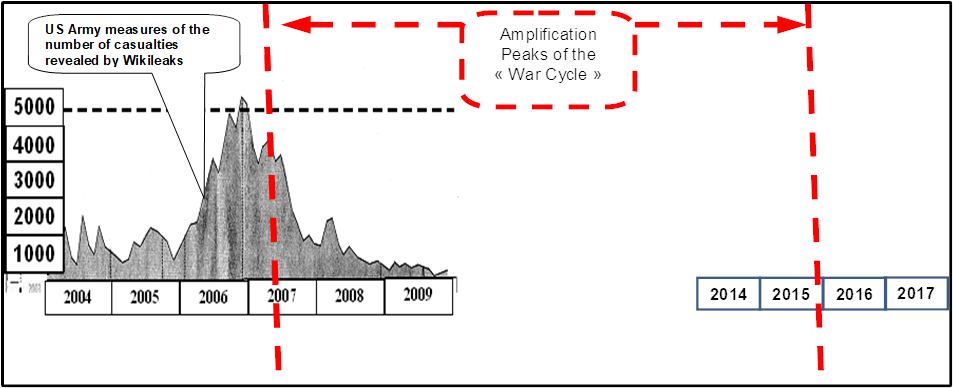
The U.S. Army has done a remarkable internal job in cataloguing all incidents as well as deaths and injuries.In 2010, following the publication of the U.S. military reports by WikiLeaks, the newspaper “Le Monde” dated Sunday 24 – Monday 25 October 2010 published a graph clearly showing a peak of violence in late 2006. Before the publication of this graph, it was admitted that the peak of violence in Iraq was rather in 2007, and the figures put forward were extremely variable depending on the sources. A careful analysis of the reports revealed by Wikileaks allowed us to measure the real violence in Iraq from 2004 to 2009. The measure is the number of victims. The source of the original graph published in Le Monde is “THE BUREAU OF INVESTIGATIVE JOURNALISM” According to U.S. Army reports published by Wikileaks, there were 110,000 deaths between 2004 and 2009. The following graph (whose form has been used to present it), shows the distribution of these victims over time (dead and wounded). It is the only reliable measure of the violence in Iraq known to date during this period and is based on reports, unlike many other estimates that relied on a few polls extrapolated by statistical methods under very different assumptions from one source to another.

This curve is based on 400,000 military reports provided by Wikileaks and exploited by the media.
2012-2014
Knowing that the amplification peak was in mid 2007 and that the next one is at the end of 2015, you can imagine from reading this graph what is presented in the following graph, if you have understood the “War Cycle”.
Is the “War Cycle” materialized?
When we look at this graph, we see half a period of the sinusoidal phenomenon that is materialized. Rather than having a single point: the outbreak of the war, we see an apparent materialization of the amplification peak by thousands of measurements.
What can someone who knows the “Cycle of Wars” conclude before 2014?
He can conclude that the departure of the Americans in 2011 from Iraq will take place in the most calm period. If this materialization is indeed that of the “War Cycle”, in the period of amplification that will follow (2014 to 2017), we will see a component of violence/civil war within Iraq regain momentum until 2015 and then a new decline in this violence/civil war. The Americans left Iraq believing that the job was done and finished. If they had been aware of this phenomenon they could have come to the same conclusions and anticipated the period that followed. Everything that happened afterwards confirmed this.
2014 et 2015
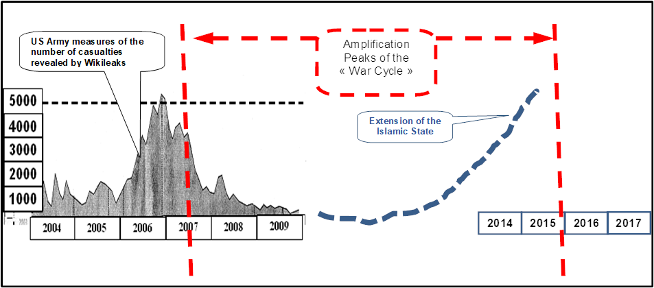
What we see in 2014 and 2015 : Since 2012 there has been a rise in violence (dotted line), confirming that the cycle identified by Wikileaks is indeed the materialization of the “War Cycle”. The media gradually spoke of a resumption of attacks, then at the end of 2013 spoke of a level of violence similar to that of 2008/2007 and then this new war in Iraq against Daech exploded all the meters.
2016
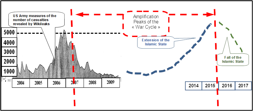
What we see in 2016 :
The conflict in Iraq is losing its intensity. The Islamic State’s retreat is resulting in a gradual recapture of the territories initially conquered in 2014. Their action will likely continue in the classic forms of attacks but with what appears to be less intensity. A reliable measure or estimates have yet to be found to supplement these elements. This is the first time the cycle could be materialized in thousands of measurement points over a period of more than 10 years. Half of the work is based on hundreds of thousands of US Army reports. However, there is a small flaw: since Wikileaks, there is no more data available through the Americans, and the Americans would rather hide this reality than contribute to confirming this materialization of the “War Cycle”. If the first part of the curve from 2004 to 2009 is not questionable, the extrapolation from 2014 to 2016 is not demonstrated. If someone were to say, “the author has mistaken his desires for realities,” I would not have a convincing argument to counter without finding data to demonstrate it. Good point, but not convincing at this point.
Iraq: Discovery of Iraqbodycount.org
In March 2017, I came across the site “Iraqbodycount.org”. This site provides data on the number of civilian deaths in Iraq. A group of British and American opponents of the 2003 Iraq War have documented and recorded the violent deaths from 2003 to 2022, so that everyone will remember the consequences of this war.
The following graph is a copy of the graph available on the Iraqbodycount.org website (https://www.iraqbodycount.org/database/) as of January 20, 2022 with the amplification and attenuation peaks of the “War Cycle” added.
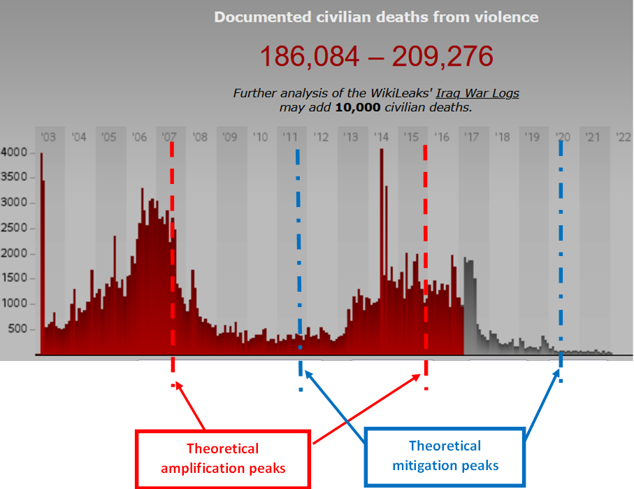
Using the data available on the site “iraqbodycount.org”, the Wikileaks data are confirmed, but more importantly it confirmed the period 2012-2017 for which there was no data available from the US military. Materialization/visualization is credible: a disturbing coincidence. These data collected by the actors of Iraqbodycount.org are the only ones existing over such a long period (2 complete periods of the “War Cycle”) and which are so credible.
Iraq: What can we conclude about the visualization/materialization of the “War Cycle”?
The principle of the Materialization/Visualization of the “War Cycle” seems credible, first with the data of the US army via Wikileaks, then from the data of Iraqbodycount.org.
- Hundreds of thousands of reports have been used to draw these curves,
- We have 2 documented sources that converge on the first period (2003-2011), then only one on the period 2011-2022,
- What is there to dispute in this visualization of the “War Cycle”? At this stage it is a beginning of proof, insofar as it will take other cases to be able to convince that it is not a simple coincidence,
- We observe a similar time lag (6 months to one year) on the 2 successive data amplification peaks (Iraq). The “observed template” is therefore a few months behind the “theoretical template”. This is not surprising, given that the cyclical phenomenon is not a perfect sinusoid, but probably an imperfect sinusoid that shifts a little at each peak, in one direction or another. We would need to know the origin of the phenomenon in order to make the necessary corrections. In 2014, there is a sharp peak that seems to correspond to the shift in the peak observed in both the outbreak of wars and the Syria graph that you can look at the following page.
Syria: Visualization of a period of the “War Cycle”
(The following text and table were taken from Wikipedia)
The following figures were all compiled by the SOHR, which is considered as an authoritative source on the subject. The figures are for documented deaths only, while SOHR estimates that another 100,000 undocumented deaths occurred in addition. The data includes not only civilians, but also all combatants on both sides.
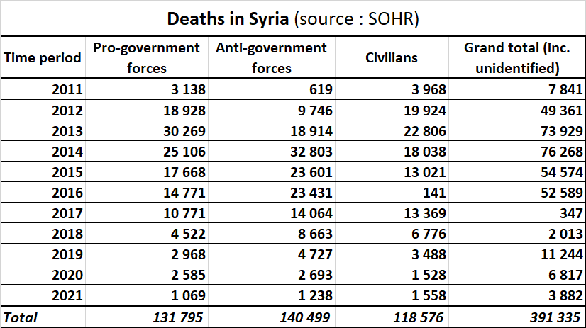
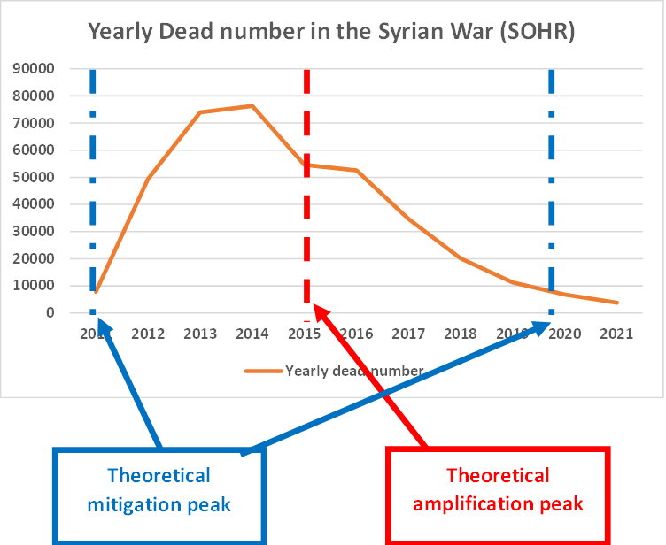
Because the war was not as long as in Iraq, the data covers only one period of the “War Cycle,” but there are similar data:
- The attenuation peaks correspond well to the minimum dead periods
- There is a lag between the “Theoretical Amplification Peak” and the “Actual Amplification Peak” which is more in 2014. This lag was seen for all the wars that broke out in 2014. In the first half of 2014 you had an Israeli-Palestinian war, the war in Ukraine, the war against the Islamic State.
What do these Iraq & Syria data bring us for the demonstration of the “War Cycle”?
The data available on the Syrian war is a little less precise, but it does confirm what is found on the Iraq war that started in 2003. This is very important, since if one were to rely solely on the dates of the wars’ outbreak, these two wars (Iraq and Syria) broke out near a mitigation peak. Showing that amplification phases have an effect on the course of the war is very difficult by CONTEXTS alone. But by curves based on tens or hundreds of thousands of reports, it gives these curious coincidences, as if the “War Cycle” had an effect on the course of the war and its victims. While in the case of the dates of the outbreak of wars alone, one can imagine that only the leaders are sensitive to this phenomenon, with such curves one can see an effect on all the combatants and armed forces involved. The materialization is consistent with the modeling.
It is recommended that you reread in “Modeling the outbreak of wars to understand the war cycle” the section ” Case 3: the accumulation of causes is well above the threshold of war triggering, even before the amplification phase” . The two wars in Iraq and Syria are two examples of this case. The visualization/materialization of the “War Cycle” helps to better understand this “Case 3“.
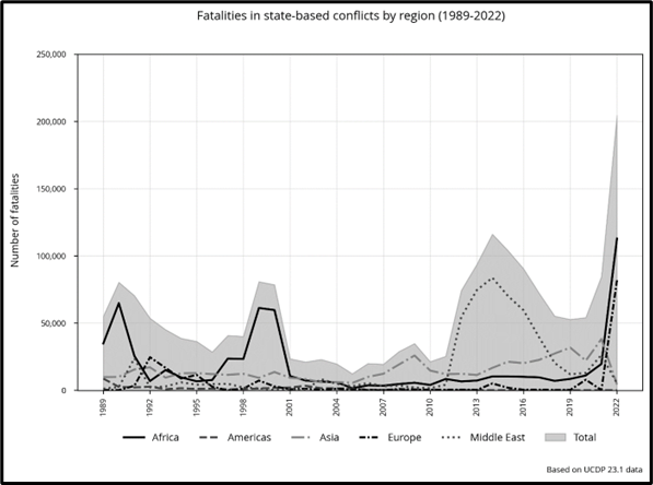
The data and graphs available on the UCDP project confirm the materialization of the War Cycle
The graph “Fatalities in state-based conflicts by Region (1989-2022)”, produced by UCDP (Uppsala Conflict Data Program) and published in 2023, completes the demonstration outlined for the materialization section. This graph confirms the demonstration of 5 phases of amplification.
These data take the materialization of the “Recurrent War Cycle” from a validated hypothesis to a virtual certainty. There will still be those who see it as a mere coincidence, but there is no more convincing evidence to date for the “Recurrent War Cycle”.
UCDP has its own definitions of war, intra-state conflicts, unilateral conflicts and deaths in armed conflicts. Here we take only the part on deaths in armed conflicts (inter- or intra-state) “Fatalities in state-based conflicts by Region”.
The graph published by UCDP is as follows:
If we add the peaks and amplification phases of the “Recurrent War Cycle”, we get this other graph:
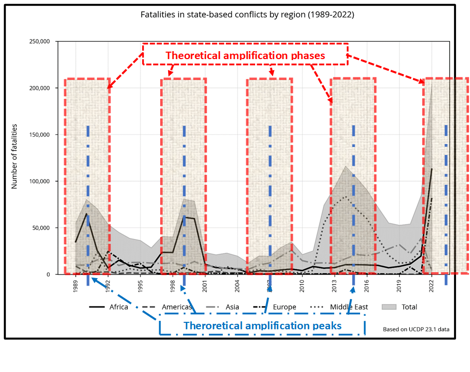 (Areas colored red or blue have been added to the UCDP chart)
What’s striking is that each phase of amplification contains peaks of fatalities, as if there were a direct and systematic correlation between the “Recurrent War Cycle” and the number of deaths due to war.
This raises many questions:
- While the 1990 and 1999 peaks are almost perfect, the 2015 & 2024 peaks are shifted. It is accepted that the current value of 3085 days for the “War Cycle” is an approximate, average value, which varies from peak to peak. Some cycles may be shorter, and amplification peaks may be shifted. To date, there has been no recalibration since the T0 of the outbreak of the First World War. This will probably have to be done soon. This research awaits a global resumption by a new multidisciplinary team to recalculate this mean value and make the necessary adjustments.
- In the amplification phase around 2007, the Middle East death toll is close to 0. This is not consistent with the fatalities of the Iraq war from 2003 onwards, as confirmed by Wikileaks and Iraqbodycount. The data, as presented by Wikileaks and Iraqbodycount, presents the UCDP team with a methodological problem, due to the fact that the categorization of the data is not the same as that of UCDP. The result is that, in the absence of a methodology equivalent to their own, all Wikileaks and Iraqbodycount data seems to have been ignored. UCDP’s data revision could reinforce this amplification phase around the 2007 amplification peak, which appears, with UCDP version 23.1, to be underestimated for Middle East data.
- The theoretical peak in December 2015 has been shifted to 2014. In fact, several wars started within a few weeks of each other in 2014 (2014 Gaza War, war in Ukraine, war against the Islamic State).
- The Ukraine-Russia war began just before the amplification phase. Should we shift the amplification peak from the 2002-2006 period?
Probably, but we don’t know where the actual amplification peak of the “War Cycle” is over the period 2022-2026. There was the Ukraine-Russia war starting in February 2022, but there’s also the Hamas-Israel war starting on October 7, 2023. In 2026, we’ll know where the real peak is, but today the worst may be yet to come. The violence of these 2 wars seems characteristic of this amplification phase. We can legitimately wonder whether certain phases of amplification have characteristics that can lead to more violent wars, and which could explain, in part, the 2 world wars we’ve had, as well as the extremely violent wars of the 2022-2026 period. - We might be able to identify the peak of the 2022-2026 period, if we had reliable data enabling us to know the evolution, in real time or with a time lag of a few months, of deaths due to wars. UCDP could probably do this, but has its own constraints and priorities, which are not those of the “War Cycle”.
- It is reasonable to say that all 5 phases of amplification covered by UCDP since 1989 are significant, taking into account possible future recalibrations and the possible future revision of UCDP on Iraqi data.
- No region systematically has a large number of deaths in each successive amplification phase. The phenomenon is true for each region, but at different times. It is the sum of the regions that is significant, since there is always one region, or even several at the same time, for each phase of amplification.
- Of course, this observation explains nothing. How can we imagine that a cyclical phenomenon could have such an influence on wars and collective human behavior? Our current knowledge doesn’t allow us to answer that question. Just because we can’t explain it doesn’t mean it doesn’t exist.
Conclusion of the Materialization of the “War Cycle”
This relationship between the amplification phases of the “War Cycle” and the available UCDP data is the most convincing evidence for the existence of the “War Cycle”. Without knowing it, UCDP could become a stake, in spite of themselves, in the credibility of the existence of the “War Cycle”.
This confirmed materialization raises questions that can only be answered by further research. In particular, it will be necessary to analyze the period from 1900 to 1989 to see whether this materialization can be confirmed over such a long period, and by what method.
The subject of “materialization” is a hotly debated topic. Some claim it’s a mere coincidence, while others put forward bizarre arguments. Some claim that it doesn’t make sense until we can explain it, whereas it would be more prudent to confirm the observation that has been made, knowing that the full explanation will not be known for many years. Nothing we know today in all the sciences (human, biological, neuropsychological and others…) allows us to explain how an “unidentified” phenomenon can have such an influence on humans as to engage in war and cause deaths in greater numbers than during attenuation phases. A simple coincidence? This is a flimsy argument for ignoring the facts.
Every leader on our planet should bear this reality in mind before committing themselves further to the wars of 2023 and beyond. But indifference on this subject and the absence of an official relay have prevented us from informing all those who might be concerned.
updated on November 10, 2023
References :
- Davies, Shawn, Therese Pettersson & Magnus Öberg (2023). Organized violence 1989-2022 and the return of conflicts between states. Journal of Peace Research (60-4)