What do we want to show?
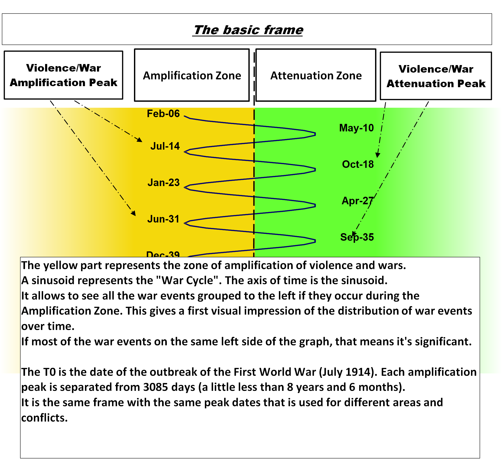
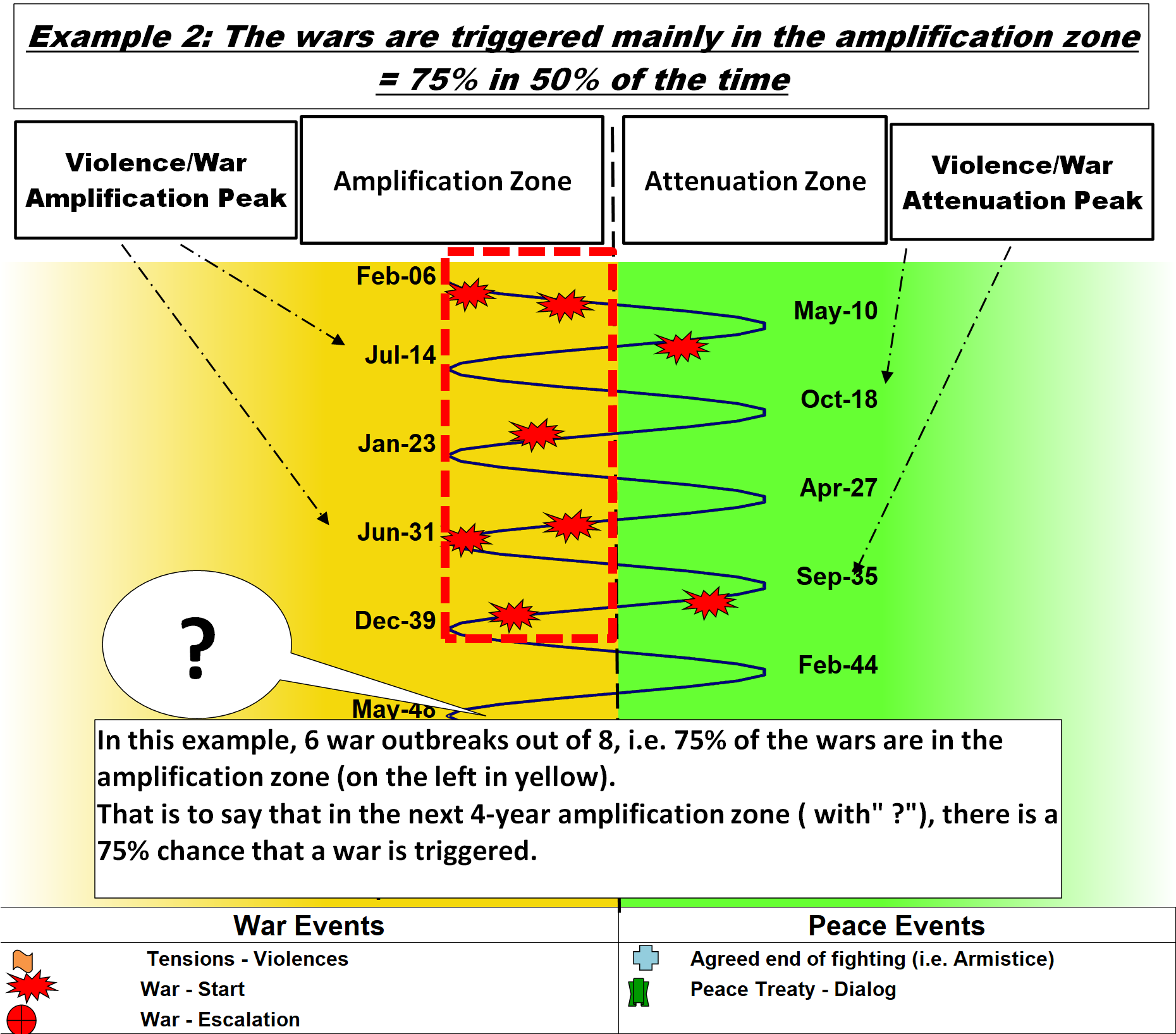
First, the distribution of the triggering of wars is not completely random. If we have successive periods of about 8 and a half years, corresponding to the “War Cycle”, we typically want to show that 70-80% of wars are triggered in a “period of amplification” of 4 years and that the 30 to 20% are in the reverse period, ie a “period of attenuation” of just over 4 years.
We do not pretend to prove that all wars follow this phenomenon but simply that it is a phenomenon that has influence, statistically demonstrable.
The starting point of this demonstration attempt is based on the work of Gaston Bouthoul who, in his “treaty on polemology”, considered the periodicity of wars to be credible and thought that it was necessary to rely on the event of the outbreak of wars in order to attempt to demonstrate the periodicity of wars.
In addition, one must find a visual presentation capable of showing the credibility of a “War Cycle” and also capable of showing predictions for the next phases of amplification or attenuation.
Finally, we must not forget that it is necessary to present some statistics on the events taken into account.
All this led to a presentation in 2 parts for each context.
- a graph showing the main events to be taken into account
- a table of differences giving a numerical positioning of the events taken into account
This presentation remains the main tool for working on the “War Cycle”. The author admits that the demonstration by this means alone is insufficient, but it remains essential when there are few wars or when the conflicts are recurrent.
This methodology of presenting contexts is important. It is unfortunate that some people make negative comments without even bothering to try to understand what has been done and the limitations recognized by the author. We are not in a binary world of “Right or Wrong”, but in a complex world where we try to describe the perceived reality by different methods, before we can judge it definitively.
How to read Graph?
What events are taken into account?
Are indicated on the Graph of each context
War events
- The dates of the outbreak of wars,
- Some tensions when the war did not take place but tensions were clearly visible,
- The dates of major escalation (or war in war), if they appear significant
Peace Events
- The dates of cessation of fighting
- The dates of peace treaty.
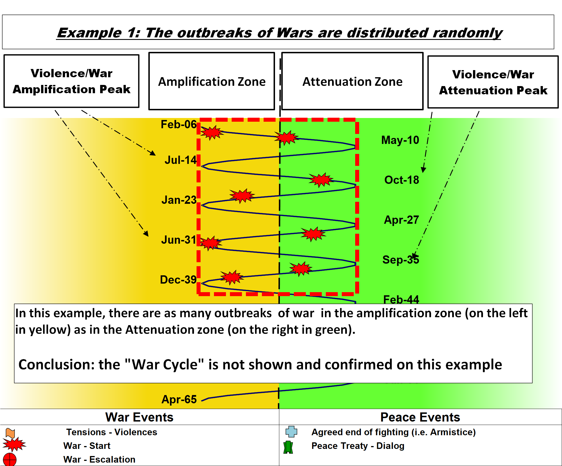
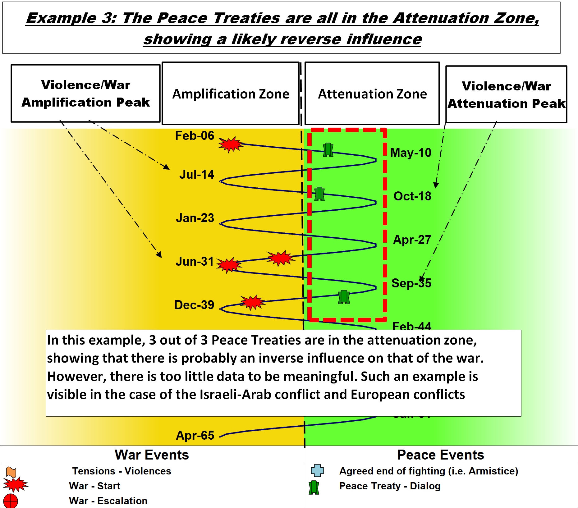
Some examples and their visual interpretation
Deviation table by Context
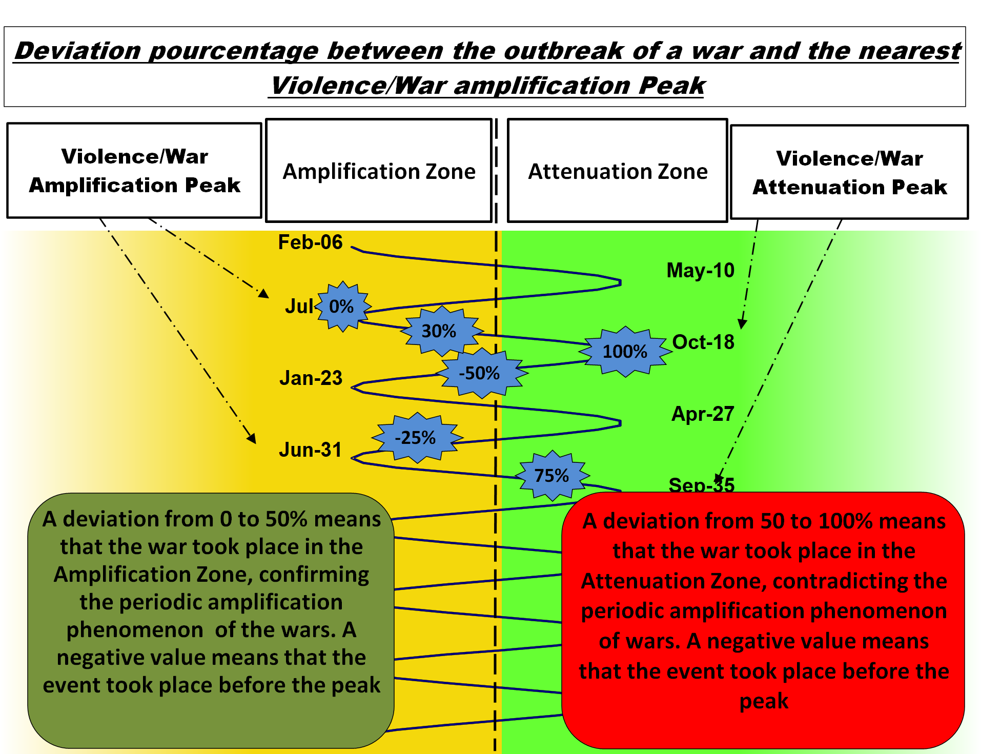
The gap between the outbreak of war and the peak of war amplification is measured in % in a deviation table
The significance of these deviations shown in the table is illustrated in the following graph.
- 0% means there is no gap and war started at the peak of amplification,
- 100% means that the war unleashed at the most unlikely moment according to the “War Cycle”, that is to say in the peak of attenuation,
- If wars were triggered completely randomly, this would mean that they were uniformly distributed with random values, hence between 0 and 100,
- If all deviations were less than 50%, it would mean that wars are all triggered in 50% of the time (instead of spreading over 100% of the time).
- If the deviation is a negative value, it means that the event occurred before the amplification peak
updated April 2, 2023
